![]()
What it does: Graphically displays the 95% confidence interval of the mean for groups of cases.
Where to find it: Under Graphs, choose Error Bar. Click on Simple, and click on Summaries for Groups of Cases. Click Define. Move your dependent variable into the box marked "Variable." Move the independent variable (or grouping variable) into the box marked "Category Axis." Click OK.
SPSS Output
Following is an example of an Error Bar plot for the confidence interval of the mean level of prejudice for each year in college.
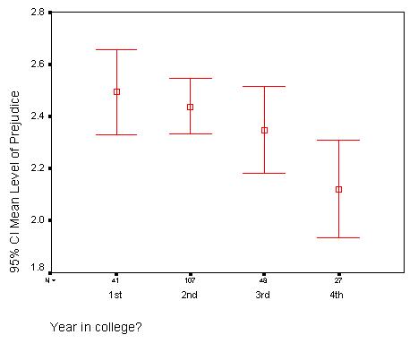
The boxes in the middle of the error bar represent the mean score. The "whiskers" represent the 95% confidence interval.
Since there is no overlap between the confidence interval of first-years and seniors, these two means are probably significantly different. Try running an ANOVA to find out!
Home
| Review Test | Decision
Tree | Procedure
List
Susan Archambault
Psychology Department, Wellesley College
Created By: Nina Schloesser '02
Created On: July 28, 2000
Last Modified: July 30, 2000