![]()
What it does: The normal Q-Q plot graphically compares the distribution of a given variable to the normal distribution (represented by a straight line).
Where to find it: Under the Graphs menu, choose Q-Q. Move the variable(s) you wish to plot into the Variables list.
SPSS Output
Following is an example of a normal Q-Q plot for the variable that represents our ethnocentrism scale.
First, you'll see the Normal Q-Q plot. Our ethnocentrism scale plot looks like this:
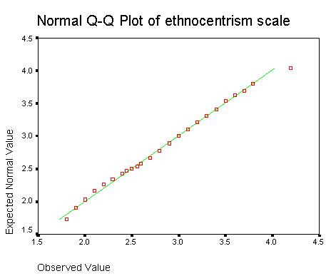
The straight line represents what our data would look like if it were perfectly normally distributed. Our actual data is represented by the squares plotted along this line. The closer the squares are to the line, the more normally distributed our data looks. Here, most of our points fall almost perfectly along the line. This is a good indicator that our data is normally distributed.
Next, you will see a graph called the Detrended Plot. I think this plot is a bit confusing, so just ignore it. :-)
Home
| Review Test | Decision
Tree | Procedure
List
Susan Archambault
Psychology Department, Wellesley College
Created By: Nina Schloesser '02
Created On: July 28, 2000
Last Modified: July 30, 2000