![]()
What it is: Scatterplots graphically compare the association between two variables. Each point in the scatterplot represents one case in the data set.
Where to find it: Under the Graphs menu, choose Scatter, then Simple, and click OK. Plot one scale or ratio variable on the X axis, and the other on the Y axis. It does not matter which variable you put on either axis.
SPSS Output
Following is a scatterplot of the variable Self-Esteem and Anxiety.
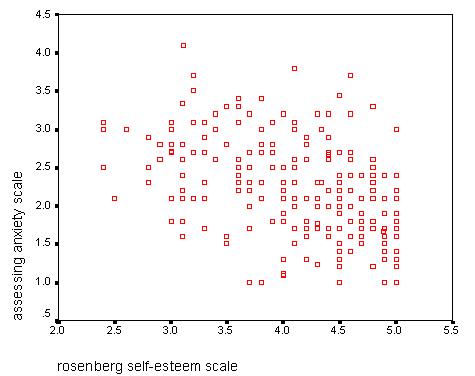
In the graph, we see a trend in the data: as scores on Self-Esteem increase, scores on Anxiety decrease. This is a negative association; as one variable increases, the other decreases. If both variables move in the same direction (that is, if one variable increases as the other increases, or if one variable decreases as the other decreases), the relationship is positive.
The more tightly clustered the data points around a negatively or positively sloped line, the stronger the association.
If the data points appear to be a cloud, there is no association between the two variables.
Home
| Review Test | Decision
Tree | Procedure
List
Susan Archambault
Psychology Department, Wellesley College
Created By: Nina Schloesser '02
Created On: July 28, 2000
Last Modified: July 30, 2000