Color – Color Basics
What is color?
Color is a perceptual experience encoded by the brain; colors can be imagined in the absence of visual stimuli, although we know relatively little about the mechanisms underlying these "memory" colors. We know more about how color is elicited in response to the relative activation of light-sensitive photoreceptors in the eye. Color is related to the physical spectrum; but that is not the end of the story.
Color can be described in terms of hue, which refers to the pure spectral color—generally red, orange, yellow, green, blue, and violet—value (or luminance, also referred to as brightness), which refers to intensity—the degree of darkness or lightness—and saturation—a fully saturated color contains no white. The value and saturation of a spectral color can alter its perception greatly. Consider brown, which can be produced by placing an orange disc on a black background and then raising the luminance of the background until the background is white. Try it!
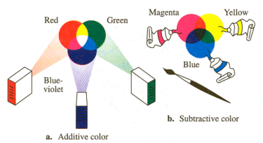
All hues can be mixed from three primary colors. There are many sets of primary colors. A set of primary colors is simply defined as follows: any set of three colors in which each color cannot be mixed by a combination of the other two. The most useful set of primaries for mixing lights are red, green and blue, because these expand the saturation of the color gamut produced.
Color mixing can be additive or subtractive. Additive mixing happens when colored lights are mixed and subtractive mixing happens when pigments are mixed:
These properties are investigated in a course activity in which alternating blue and yellow dots are painted on an index card and viewed from a distance beyond which individual dots can be discerned. The wet dots are then mixed and re-viewed. Blue and yellow light reflected from individual dots is optically mixed by an additive process while blue and yellow pigments are mixed by a subtractive one. What do you expect you’ll see when you look at a pointillist scene comprised of tiny blue and yellow dots? Try it yourself!
How is color measured?
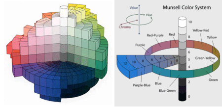
The Munsell system, developed by the artist Albert Munsell, characterizes color in purely perceptual terms: Munsell mixed colored chips to produce a series of a 100 colors spanning the color circle with what he considered to be equal color distances between all pairs of colors. Hue (the property of color we describe as “red”, “orange”, “blue” etc) is displayed around the perimeter of slices through the Munsell color solid; units of “chroma” radiate outward from the center; and brightness, from 0 for black to 10 for white, define the trunk:
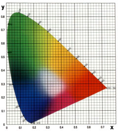 1931 CIE Standard
The CIE system measures color starting with spectral power distribution (SPD)— a quantitative measure of the power of light at each wavelength in the visible spectrum, measured with a spectrophotometer—factored by the sensitivity of the photoreceptors. This is used to calculate Tristimulus values—colors that can be produced by the primary colors blue, green, and red—by means of color matching functions. The tristimulus values are used to calculate the brightness parameter Y and chromaticity coordinates x and y for a chromaticity diagram which shows the boundaries of color perception and the range of color reproduction. The system can be used to (a) measure color and model color vision, (b) predict the results of additive mixing, and (c) describe standard illuminants in terms of the color temperature of a blackbody source.
The CIE system offers greater precision in color measurement than the Munsell since its parameters are based on the spectral power distribution—a quantitative measurement of the light reflected from a colored object—and are factored by sensitivity curves that have been measured for the human eye. The downside of the CIE system is that it clearly over-represents some regions of the spectrum (like green), unlike the Munsell color system.
To get a real sense for how this kind of color modeling works students in the course will use a PR655 spectrophotometer to quantify color and illuminants during a lab activity, and compare the spectra they obtain with the colors of the objects as they perceive them.
Psychology of Color
What does color add to visual experience? For starters, objects of like value but differing color are made discernable with color vision, such as a red apple against the green foliage of a tree. But perhaps more curious is the emotional nature of color—to be green with envy, or sad with the blues…
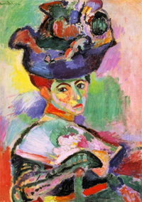
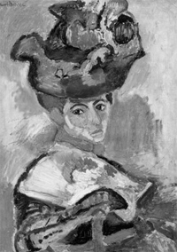
People really like color. They pay lots of money for the finest color televisions, even though black and white would do a fine job of communicating the shapes, movement, and spatial scenes of a program. Some artists, like Mark Rothko, have made moving paintings simply from large colored canvases. Pictured below is a portrait by Matisse in which the form of a young lady wearing a hat is made completely clear even though the color choices and transitions seem bizarre. The success of the piece can be understood once it is made achromatic, an image that shows the accuracy of the values used. Here, Matisse hits home the point that color is not necessary as an indicator of form, but it certainly does make an image more captivating.
|
|
Henri Matisse's Woman with a Hat in color (left) and black and white (right) (credit) |
While some emotional responses to color are deep and may be universal, most are culturally biased. Different cultures use different colors to symbolize the same powerful concepts. In much of the western world black is associated with death and mourning whereas in East Asia white is the color of death.